Simplifying Fragmented Healthcare — Curevo Platform Design
Curevo is a healthcare platform concept designed to connect patients, doctors, and hospitals in one system. The goal was to take a process that's normally scattered across departments, paper records, and multiple platforms, and turn it into something patients could actually navigate with confidence.
Role
Product Designer
Timeline
Sep, 2025
Project Type
Concept based
Tools
Figma

The Problem
Healthcare information is fragmented by default. Patient history lives across different departments and hospitals, so doctors don't get the full picture and patients can't manage their own care efficiently. On the patient side, this shows up as:
Long waiting times and appointment confusion
No transparency in billing or prescription management
No single place to track medical history across providers
The brief I set for myself: design a platform that connects patients, doctors, and hospitals — without adding more complexity to an already confusing system.
Researching two very different users
I built personas around two distinct healthcare behaviors, because "patients" isn't one user group — it's at least two:
Priya, 27 — First-Time Visitor. Researches doctors online before ever booking. Her friction wasn't about finding doctors — it was about trusting them:
Too many results with no useful filters (specialization, experience, ratings)
No visible way to verify a doctor's credentials
Booking flows that assume prior familiarity with the platform
No clarity on consultation types or real-time availability
Rahul, 35 — Regular Patient. Manages routine visits and follow-ups around a busy schedule. His friction was about continuity, not discovery:
Re-searching for the same doctor every time he needs a follow-up
Physical prescriptions and reports that get lost between visits
Medical records scattered across different hospital systems
No reminders for medicine timing or upcoming appointments
Repeating his medical history to every new doctor
What this told me: first-time users need trust signals upfront (verification, filters, transparency). Returning users need continuity (saved history, records in one place, reminders). A single design couldn't treat both the same way — the platform needed to support quick trust-building and long-term record continuity at once.


Design Decisions
Visual identity built around trust, not just aesthetics. Primary blue for reliability and professionalism, neutral grays for readability, with green/yellow/red reserved specifically for status and alerts — so color always carries meaning, not just branding.
Product Sans typography for a clean, geometric, highly legible interface — important for a platform where users are often reading medical information under stress or time pressure.
Structured homepage hierarchy — clear navigation and sectioning so users can scan services and information without hunting for it, directly addressing Priya's "too many results, no filters" pain point.
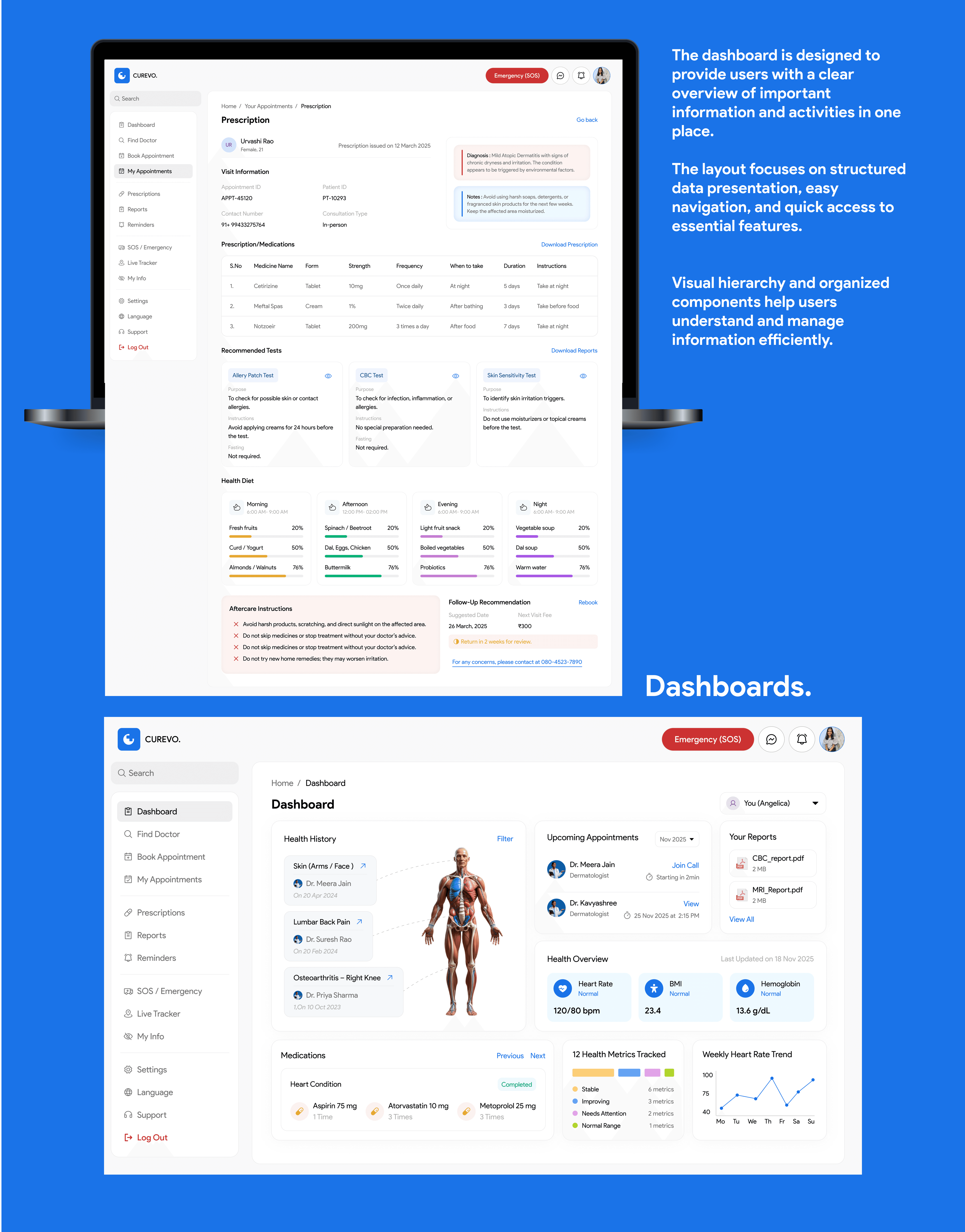
Unified dashboard — a single view for appointments, records, and activity, designed to solve Rahul's exact problem: records and history scattered across platforms with no central access point.
Consistent spacing and minimal visual noise throughout, so the platform reads as calm and professional rather than clinical or overwhelming — deliberately built to feel less intimidating than a typical hospital system.



Key takeaway