Rethinking Navigation & Trust for a Dev Community - Flutter Kanpur Community
FlutterKanpur is a developer community app for meetups, hackathons, and knowledge-sharing. I designed the original app during a hackathon, then joined as the community's designer. Once real usage data came in, clear structural problems emerged — this project is the revamp based on that evidence.
Role
Founding Designer
Timeline
Dec 2025 - Jan 2026
Project Type
Community
Tools
Figma, Notion

The Problems (found by walking the app as a first-time user)
Forced onboarding, no context. App opened straight to login/signup. No explanation of what FlutterKanpur was or why signing up mattered.
Website-on-a-phone feel. No bottom navigation — everything buried in a top-right menu. Didn't behave like a native mobile app.
Weak visual hierarchy. Inconsistent font sizes, no clear separation between headings, subtext, and content — hard to scan.
Dead-end community features. Blogs and leaderboards existed but couldn't be interacted with — no replies, no clarity on how leaderboard ranks were even earned.
Disorganized events. No categorization, no clear "Register Now" CTA — users couldn't tell what was active or relevant.
No profile/account management. Users had no space to view activity or manage their own info.
How I validated these problems
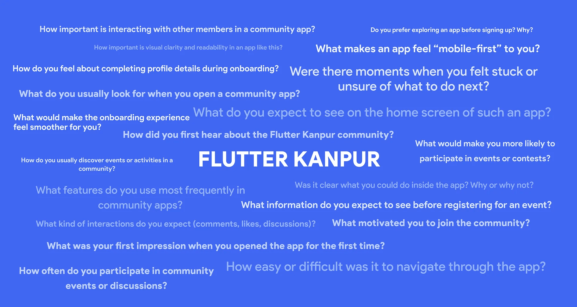
Surveyed 43 community members on how they actually use the app and what they expected from it.
Ran usability testing with real tasks: explore the app, find an event, join a discussion, update a profile, find contribution options.
Built an affinity map to sort scattered feedback into patterns — separating surface complaints from root usability issues.
Key insight from research
Users didn't lack interest — they lacked clarity. Navigation was the #1 usability barrier, and people wanted visible recognition (badges/ranks) to feel motivated to contribute.
Design Process
This project followed the Design Thinking framework.
Empathize
Define
Ideate
Prototype
Test
Rather than treating these as isolated phases, the process remained iterative throughout the project.




What I Designed (the decisions, not just the screens)
Pre-login intro (3 screens): Gave users context about the community before asking them to commit to signup — addressing "I just wanted to explore first."
Simplified auth flow: Reduced friction in login/signup once users had context, instead of leading with it.
Step-based profile setup: Broke profile completion into stages with skip-and-continue-later options, instead of one long form.
Mobile-first navigation: Introduced structure and back-actions that matched native app conventions, not web patterns.
Restructured community section: Added real threading and reply structures to discussions so contribution felt possible, not passive.
Segmented profile: Split account settings, activity, and achievements into distinct sub-sections to cut cognitive load.
Achievement system: Introduced badges, ranks, and leaderboards tied to actual visible criteria — solving "I don't know what this is based on."
Explore module: Built a dedicated discovery space separate from the home feed.


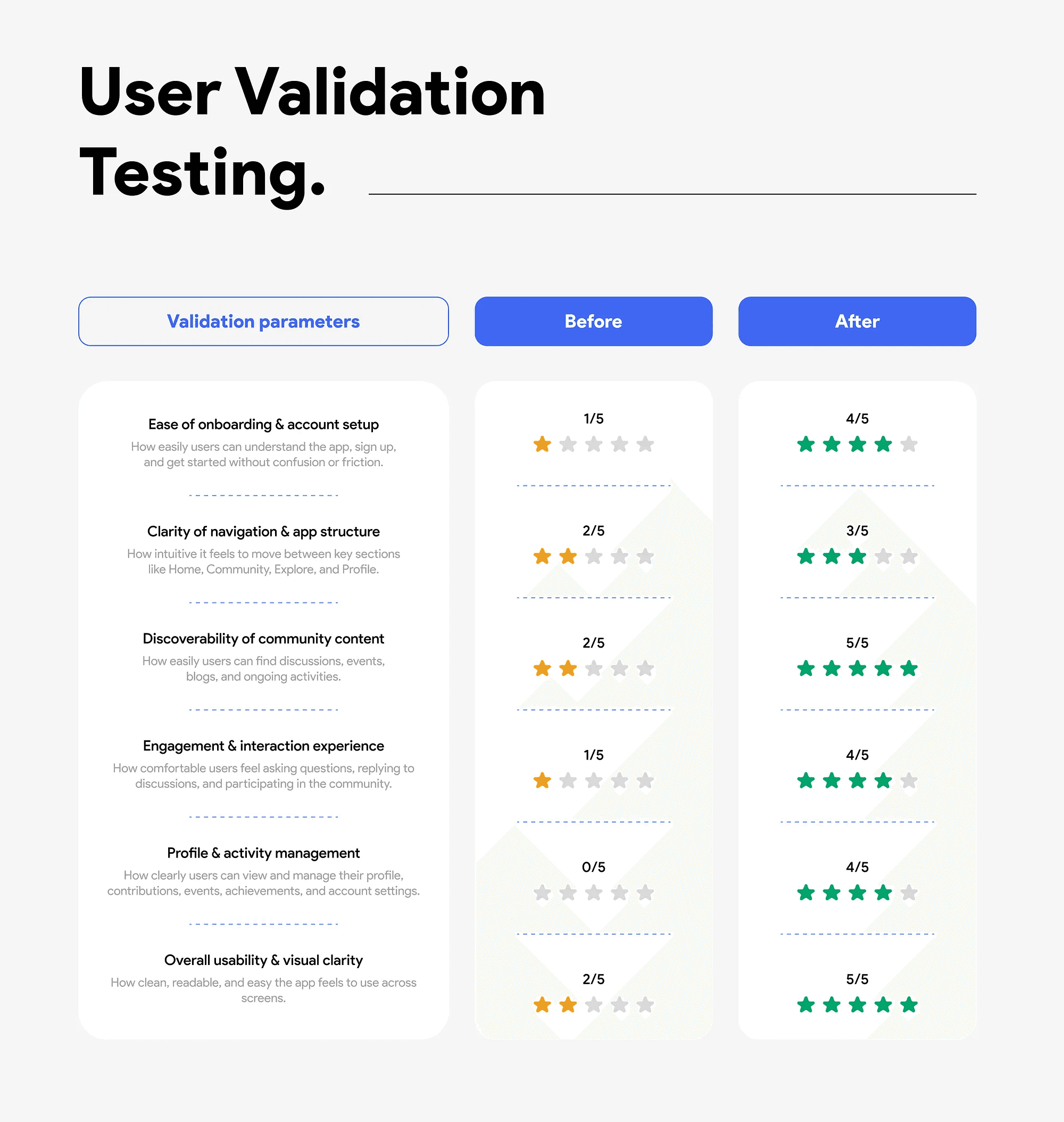
Validation
After redesign, I ran design validation testing against the original pain points to confirm the fixes actually landed — not just assumed better.