Structured Design System: Tokens to Dashboards
A design system built to solve a problem every growing product eventually hits: inconsistent components, one-off spacing decisions, and no single source of truth for how the UI should look or behave. Instead of designing screens first, I started from the atomic level — tokens — and built upward, so every component inherits the same rules by default instead of being redesigned each time.
Role
Product Designer
Timeline
April, 2026
Project Type
Concept based
Tools
Figma

Foundations & Tokens
Every decision in this system traces back to a token — color, typography, spacing, and shadow values defined once and reused everywhere. This was the deliberate starting point: instead of designing screens first and extracting patterns later, I built the rules first so every component downstream stays consistent by default, not by manual matching.
Color & typography system — a defined palette and type scale built for hierarchy and accessibility, not decoration
Spacing & grid rules — consistent spacing units and a layout grid so alignment is systemic, not eyeballed per screen
Shadows & elevation — a consistent depth system so layering (cards, modals, dropdowns) reads the same across the whole product
Component Library
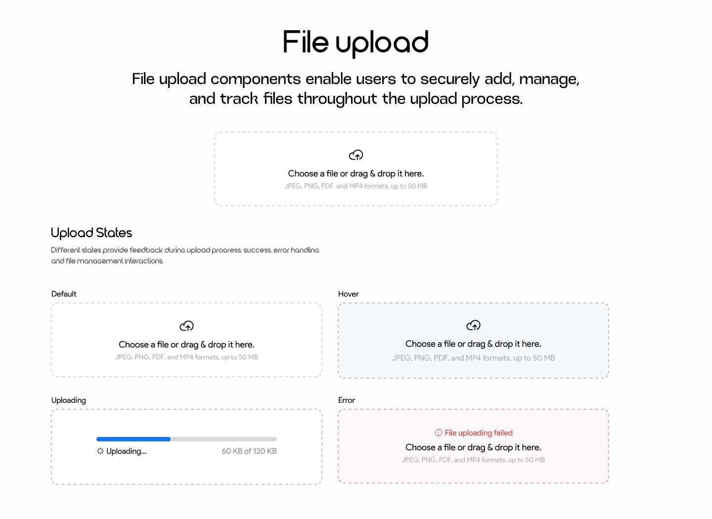
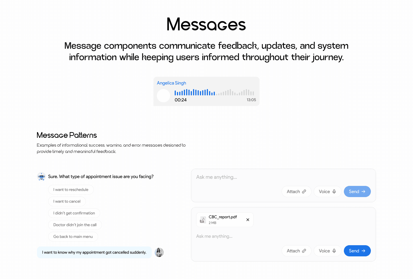
Simple components: Buttons, inputs, checkboxes, avatars, tooltips, labels, pagination, file upload — each built as a reusable, states-covered unit (default, hover, disabled, error) rather than a single static version.
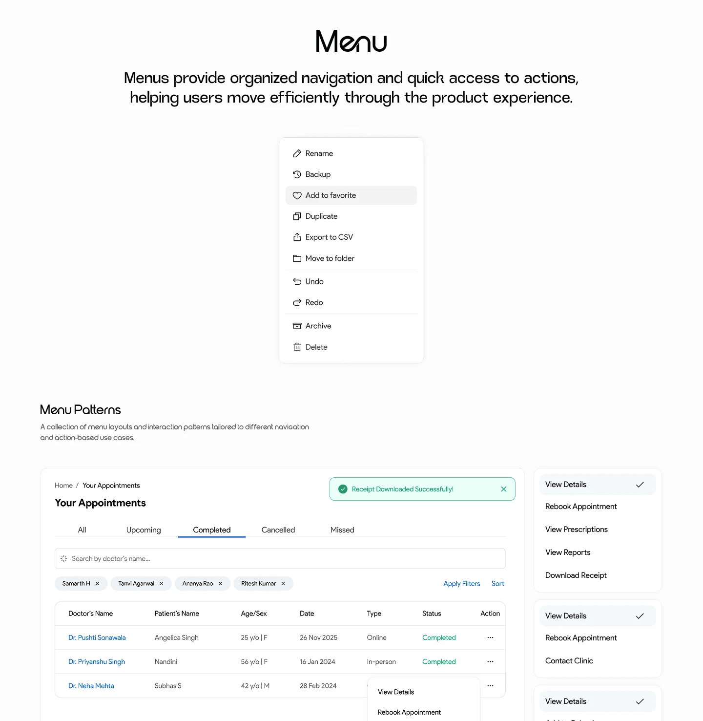
Complex components: Tables and dashboards assembled entirely from the simple component set — proving the system holds up under real, data-dense UI, not just isolated buttons on a page.


Simple Components
The foundational building blocks — designed once, reused everywhere, so no screen ever needs a one-off variant.
Buttons (states: default, hover, disabled, loading)
Inputs & form fields
Checkboxes & selection controls
Labels & tags
Avatars
Tooltips
Pagination
Icons


Complex Components






Key takeaway